A COMPLETELY NEW APPROACH TO RADIO IMAGING
PRODUCT DESIGN & LAUNCH
CREATIVE DIRECTION – VISUAL & BRAND
Terrestrial radio had grown stale and stodgy, and with the growing popularity of satellite, found it near impossible to compete with the cutting-edge technology and fresh attitude of Sirius/XM.
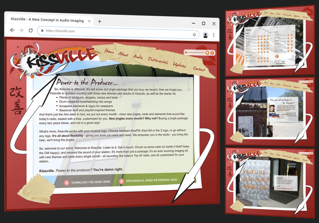
So, we created Kissville, a brand new concept in audio imaging…the first package of its kind which was set up on a monthly subscription-based model for terrestrial radio. Stations could now cycle through its imaging and redirect the attitude and feel of their station monthly…instead of waiting years.
PROCESS AND RESULTS
“Back in the old days,” a radio station would buy an imaging package (ramps, slogans, shotguns, intros, weather/news/traffic ‘utilities,’ etc.), the studio would record the package, deliver it for ‘x’ amount of dollars and the radio stations budget would be blown for imaging over the next few years until it was time for a refresh. Kissville set out to fix all that with its budget-minded monthly subscription model—delivering fresh content on a continual basis…with attitude!
David, Chris “UK,” and I developed a “voice” for Kissville through a fictional character named Smoochie and the Japanese philosophy of Kai Zen, which means “continuous improvement.”
I was charged with creating the visual look and feel of the product, its website, and all marketing collateral, and execute it in the voice of Smoochie. One of the challenges was that we didn’t want to show a mixing board or any of the other tired, obvious, music studio imagery. So I combined Smoochie’s voice with the idea of community, went out and shot some pictures of various apartment complexes, building textures and back-alley dumpsters, and created what I perceived Kissville to look like, which of course is where Smoochie lives.
The product itself, combined with its witty attitude and marketing voice, shattered the first month’s sales goals by 400%!
Smoochie says, “That’s a helluva win.”
And it was.
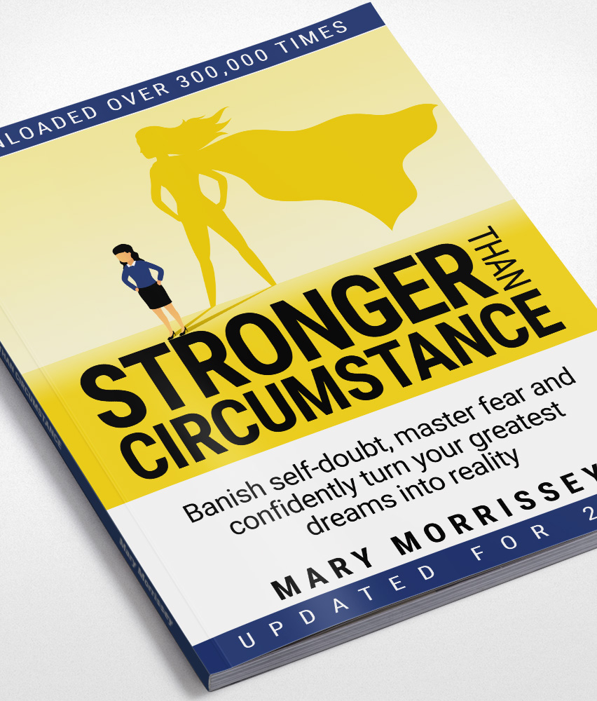
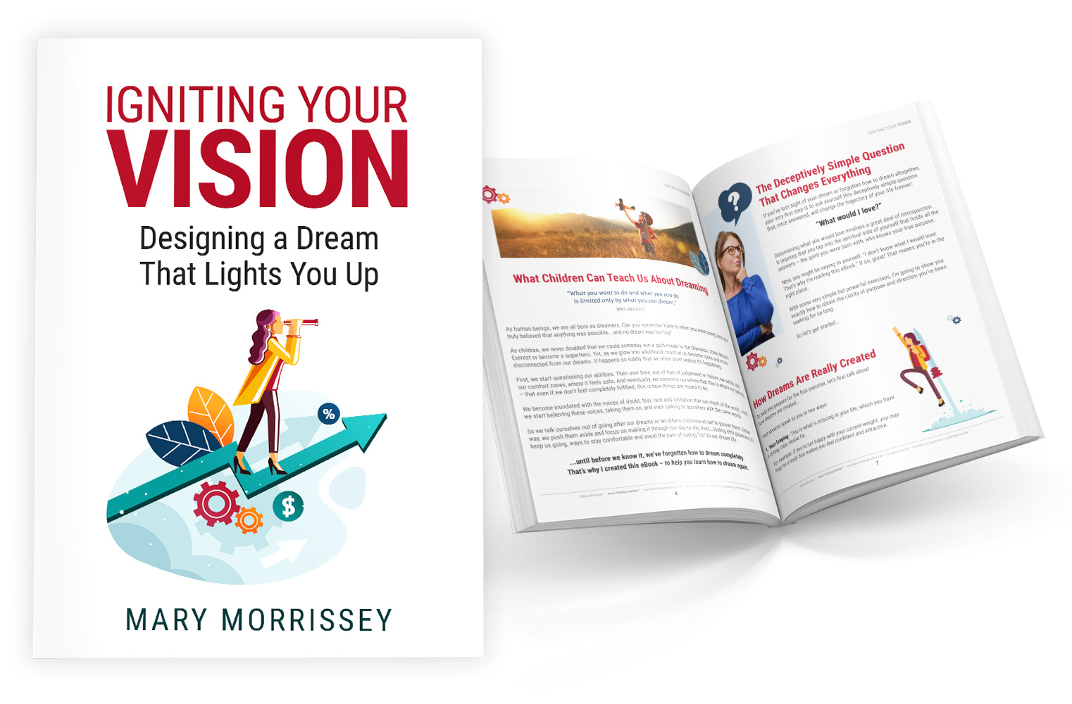
DON'T JUDGE AN eBOOK...
The challenge with eBooks in general is that we judge them by their cover. They offer little to no perceived value from a visual perspective to the user to help drive conversions. I was tasked to change that by redesigning existing book covers, as well as new books in their entirety.
The results were a 12% increase in eBook opt-ins with an overall increase of 17% funnel conversions.
