Branding

It’s so much more than a logo. Sometimes it’s all you got. Some times it’s not about the logo at all. Sometimes, it’s a word, a color, an attitude, or three musical notes played in succession. Sometimes, it’s all the above and that’s where the magic is…when a brand comes to life.

I have always been fascinated with branding and the idea of invoking a “personality” into a bunch of letters that spell a company name. Think about it—Nike, Google, McDonald’s, NBC, they’re all just letters composing a name of an “entity” you can’t see. But in reading those names, you saw every one of them. 

This website, the resume, the logo, the tone…are all examples of my own brand. It’s bold, yet playful. Serious, but approachable. And in designing and building it, it was relentless (that actually made me laugh typing that), but rewarding. It’s a perfect representation of who I am to work with…but relentless in a good way.

I’m still working on this section (okay, a lot of sections), but hopefully the example of this site gives you some indication that I do understand branding and I would love to talk about developing yours.

Bee, you are one bad motherf***er!

- Robert, Creative Director

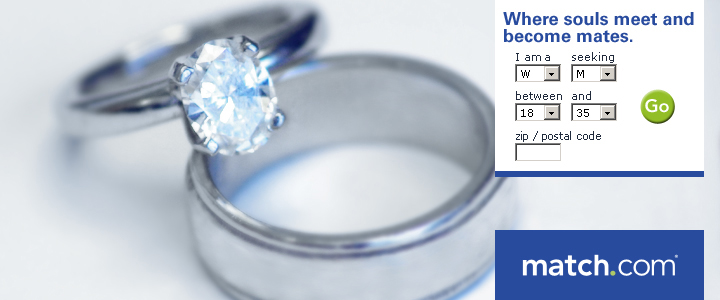
I was working on some ad concepts for Match.com. One of the concepts was about finding long-term commitment through the service along with the challenge of not using stock imagery of people. The CTRs had been declining on all the “people” ads and were getting lost in the noise.

My thought was to use a pair of wedding bands as a focal image around the search boxes built into the banners we were doing. 

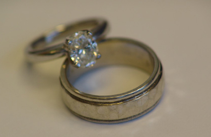
The second challenge was that all the stock imagery of wedding bands were incredibly cheesy, and mostly yellow gold which wasn’t what I wanted. So I found a couple of volunteers nearby who were married and had platinum wedding bands, borrowed their rings, and took a picture of them right there on my desk. 

Here’s the original image…

Fluorescent lighting, no flash, texture on the men’s band that doesn’t translate at all in the photo, atrocious coloration on the desk—the whole 9-yards of “why the hell would you use this picture in an ad?

In fact, that’s exactly what my creative director, Robert asked me.

I spent some time with the image in Photoshop, created the ad, and then showed this to Robert…

He smiled and said, “Bee, you are one bad motherfudger.”

Only he didn’t say “fudge.” He said THE word. The big one. The Queen Mother of dirty words. The ‘F dash dash DASH’ word!

I laughed and asked, “can I use that as a testimonial?”

“Damn right, you can!”

If you could use a bad motherfudger on your team, let’s talk.

You're a nut!

— More than one person

THIS SECTION CLOSED for 2 WEEKS…

...TO CLEAN AND COMPLETE

AMERICA'S FAVORITE*

Creative Art Director's Website

* The statements made regarding these products have not been evaluated by the Food and Drug Administration. The efficacy of these products has not been confirmed by FDA-approved research. These products are not intended to diagnose, treat, cure or prevent any disease.

Connect with Bee

Hey, I get it…no one wants to fill out a contact form and wonder where the hell it goes after you hit ‘send’, but the spambots are ridiculous and the unsolicited calls are absurd.

So, please leave a message below and I will get back with you. The form works, I receive these, it’s all good. 

tsp

Hope your birthday stinks like dog poop!
- Your Sister

About Bee

Bee, you are one bad motherf***er!

Robert, creative director

A diverse creative and marketing background in video, print, and digital media for in-house teams and agency environments has cultivated a strong passion to evolve ideas into stories, and stories into brands.

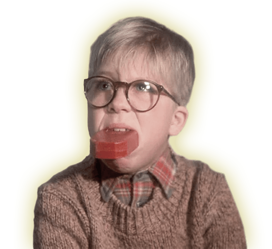
Was a cute kid too.

CONCEPT | EXECUTION

You execute ideas in
a masterful way.

Amanda, copywriter

I am an artist with an entrepreneurial spirit. In my twenty-ish years, I have been everything from copywriter, production artist, art director, creative director, to VP of marketing for an audio imaging company in Dallas. Plus, I wrote, produced, and directed a full-length feature film which won several awards in the indie film festival circuit. My focus on design and marketing has been a constant throughout my career, but I do enjoy having the breadth of scope in my skills to bring to the table.

I have worked in agency as well as in-house team environments with such brands as GlaxoSmithKline, Match.com, Pep Boys, and Meritage Homes to name a few. I am well versed in the various types and structures of organizations (B2B and B2C) and the branding needs and details that come with each.

I am seasoned (more than I’d care to admit), incredibly self-disciplined, creative, and I love things like brand integrity, attention to detail, and communication (which is evident in my writing more than you probably care to read).

From concept to execution, let’s connect and find out how I can help with your creative needs.

AWARDS | RECOGNITION

AAF Dallas ADDY

Project: Michael Johnson Performance Center Website thru GDD Interactive
Role: UI Art Direction

ePharma Awards

Project: eDetail for Altabax, GlaxoSmithKline
Role: Concept, Art Direction, Storyboarding

TM Century

2x Employee of the month: March and August, VP Marketing

Best Picture,
Best Dramatic Feature,
Only Human Award

Project: DONOVAN Feature Film Recognized by Bare Bones Int. Film Festival and Ft. Worth Indie Film Showcase
Role: Writer, Producer, Director