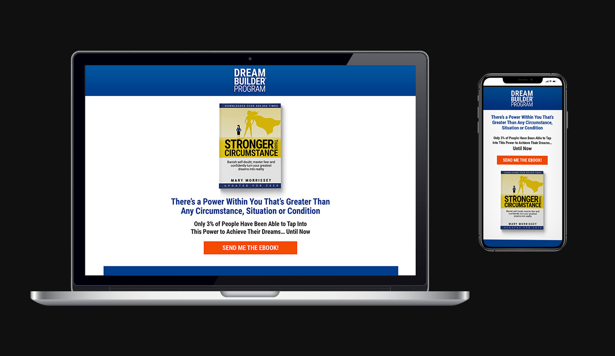
BTI utilizes a long-form funnel marketing strategy for life coaching services, training, and events. The entry-point for the live event sales funnel needed a complete redesign, and with it, a performance boost.
The old page was outdated, cluttered, had no visual hierarchy, lacked a focused incentive for users, and droned on for a mile. (And I really wish I had thought to grab a screenshot of its “before” state.)
PROCESS AND RESULTS
I had access to study some of the UX aspects of the page and what users tend to engage with, created several A/B testing entry-point pages, and optimized each one until we landed on a winner.
We simplified the messaging and reduced the visual elements from “stimulus overload” to “straight-to-the-point,” which resulted in a 14.8% overall increase on opt-ins, and a staggering 57% conversion increase thru the secondary tier of the funnel.
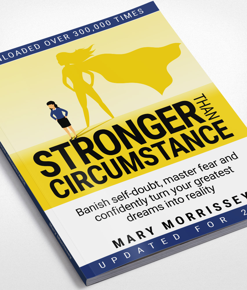
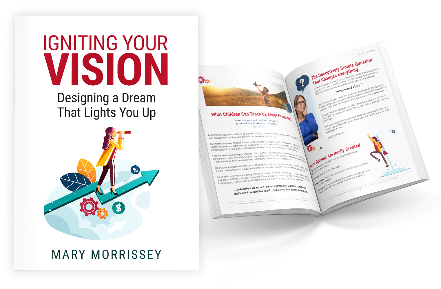
But it didn’t stop there. Part of what leant to the outdated look and feel of the old landing page was the eBook offer itself. More on that below.
DON'T JUDGE AN eBOOK...
The challenge with eBooks in general is that we judge them by their cover. They offer little to no perceived value from a visual perspective to the user to help drive conversions. I was tasked to change that by redesigning existing book covers, as well as new books in their entirety.
The results were a 12% increase in eBook opt-ins with an overall increase of 17% funnel conversions.
Bee, you are one bad motherf***er!
- Robert, Creative Director
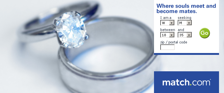
I was working on some ad concepts for Match.com. One of the concepts was about finding long-term commitment through the service along with the challenge of not using stock imagery of people. The CTRs had been declining on all the “people” ads and were getting lost in the noise.
My thought was to use a pair of wedding bands as a focal image around the search boxes built into the banners we were doing.
The second challenge was that all the stock imagery of wedding bands were incredibly cheesy, and mostly yellow gold which wasn’t what I wanted. So I found a couple of in-office volunteers who were married (not to each other) and who had platinum wedding bands, borrowed their rings, and took a picture of them right there on my desk.
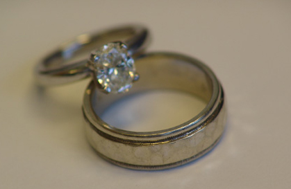
Here’s the original image…
Fluorescent lighting, no flash, texture on the men’s band that doesn’t translate at all in the photo, atrocious coloration on the desk—the whole 9-yards of “why the hell would you use this picture in an ad?“
In fact, that’s exactly what my creative director, Robert asked me.
I spent some time with the image in Photoshop, created the ad, and then showed this to Robert…
He smiled and said, “Bee, you are one bad motherfudger.”
Only he didn’t say “fudge.” He said THE word. The big one. The Queen Mother of dirty words. The ‘F dash dash DASH’ word!
I asked, “can I use that as a testimonial?”
“Damn right, you can!”
If you could use a bad motherfudger on your team, let’s talk.
A long time ago in a friendly neighborhood nearby...
(way to mix pop culture references, B)
We had these places called “malls,” and in them were tons of different kinds of stores. It was kinda like Amazon if you could physically walk into Amazon—and within it, you could walk into each department as its own store.
Mindblowing, right?
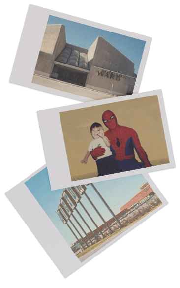
Anyway, when I was a kid, my mom took me to meet Spider-Man. I stood in line with other excited little kids to meet my superhero…uh…hero. I remember being quite freaked out by his eyes…but then clearly I got over it given the picture of me slinging an imaginary web.
Flash forward at least a couple years later (give or take a decade or 3), I’m having coffee with an actor friend of mine who was helping me get started on making a movie. He’s a bit older than me and we were talking about early gigs as “actors with delusional aspirations.” He told me that when he first moved into the area, his first “acting gig” was dressing up as Spider-Man and making appearances at the Big Town Mall in Mesquite.
I said, “at the Montgomery Wards?” He looked a bit surprised and said yes. Well, you can see where the conversation went. And while we can’t be 100% certain, we did the math and at the time there were only 3 guys including him doing that gig, so we are somewhat sorta kinda, around a 1 in 3 chance sure that I had my picture taken with my friend dressed as Spider-Man when I was a kid.
Okay, so 33.3% isn’t much, but it’s still kinda cool to think about (and would be a helluva CTR).
* The statements made regarding these products have not been evaluated by the Food and Drug Administration. The efficacy of these products has not been confirmed by FDA-approved research. These products are not intended to diagnose, treat, cure or prevent any disease.
Connect with Bee
Hey there, so glad you want to connect. Please reach me through my LinkedIn profile. So much spam here through the old form, or email, or any other link. So much spam. Can’t do it any more.
Did I mention so much spam?
Thank you…except to the spammers.
Hope your birthday stinks like dog poop! - My Sister
A diverse creative and marketing background in video, print, and digital media for in-house teams and agency environments has cultivated a strong passion to evolve ideas into stories, and stories into brands.
Was a cute kid too.
CONCEPT | EXECUTION
You execute ideas in a masterful way.
Amanda, copywriter
I am an artist with an entrepreneurial spirit. In my twenty-ish years, I have been everything from copywriter, production artist, art director, creative director, to VP of marketing for an audio imaging company in Dallas. Plus, I wrote, produced, and directed a full-length feature film which won several awards in the indie film festival circuit. My focus on design and marketing has been a constant throughout my career, but I do enjoy having the breadth of scope in my skills to bring to the table.
I have worked in agency as well as in-house team environments with such brands as Johnson & Johnson, The U.S. Army, Lowe’s, and AT&T to name a few. I am well versed in the various types and structures of organizations (B2B and B2C) and the branding needs and details that come with each.
I am talented and smart, incredibly self-disciplined, creative, and I love things like brand integrity, attention to detail, and communication (which is evident in my writing more than you probably care to read).
From concept to execution, let’s connect and find out how I can help with your creative needs.
AWARDS | RECOGNITION
AAF Dallas ADDY
Project: Michael Johnson Performance Center Website thru GDD Interactive
Role: UI Art Direction
ePharma Awards
Project: eDetail for Altabax, GlaxoSmithKline
Role: Concept, Art Direction, Storyboarding
TM Century
2x Employee of the month: March and August, VP Marketing
Why include this? Because 3 months into this job, I was already changing market perception of our brand. Five months later, we launched Kissville.
Best Picture, Best Dramatic Feature, Only Human Award
Project: DONOVAN Feature Film Recognized by Bare Bones Int. Film Festival and Ft. Worth Indie Film Showcase